REPORTS – PIVOT TABLES
A powerful feature of Goolara Symphonie’s report generation is the ability to choose the pivot point for your data. Did the opens vary by store number? Did you get more clickthroughs for men or women? Examine the opens and clickthroughs based on any demographics, then zero in on what is working and what isn’t. If some campaigns are working better than others within certain demographics, pivot tables can help you quickly find out which ones are and why.
Using Demographics
Even if you are only collecting data in the standard demographic categories (gender, age, state, etc.), pivot tables can help you better understand who is engaged with your emails. These broad categories hold a wealth of useful information for the savvy marketing professional. The ability to see how this information is trending and then modifying your efforts based on it might make the difference between an average campaign and great one.
With pivot tables, you can choose which demographics contain the most useful data, and then examine those results for those categories.
Best of all, Goolara Symphonie now lets you generate pivot reports for transactional email as well as for promotional email. This is a great solution for the company that is using the API to generate highly personalized emails instead of the standard bulk mailing approach. If your company sends a lot of transactional email, and you are looking for better data on these mailings, this feature can pay for itself in no time.
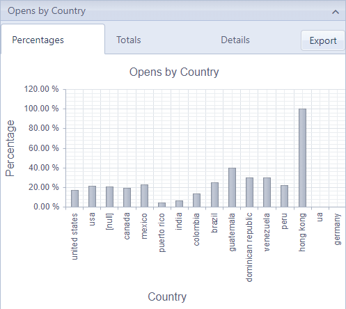
In this example shown above, the data is pivoted across the US state of the recipient, and you can see a fairly large variation in opens rates for different states.
